Turning Risk Data into Decisions: The Strategic Power of Risk Scoring and Visualization
To make informed decisions, leaders need clarity, not complexity. This is where risk scoring and visualization come in. By translating raw data into digestible formats, these tools empower decision-makers to prioritize threats, allocate resources, and act with confidence.
In this article, we’ll explore how risk scoring and visualization elevate your risk management strategy and drive smarter, faster business decisions.
The Strategic “Why” of Risk Scoring
Risk assessments identify what can go wrong and risk scoring helps quantify it. Visualization then brings that data to life, showing where risks are growing, where to act, and how decisions align with business goals. Risk scoring assigns a numerical value to a risk to determine its significance.
A well-designed risk scoring model helps to:
Enhance communication across teams: Risk scores turn complex data into clear, actionable metrics for both technical and business teams.
Prioritize efforts: Not all risks are equal, and risk scoring establishes a clear hierarchy that helps identify which ones need immediate attention.
Support data-driven decisions: Risk scores add objectivity to decisions, making it easier to justify actions and apply the right controls.
The value of scoring is evident in real-world cases. For instance, when the Bank of Canada needed to understand the financial implications of climate-related risks, it implemented a scoring framework to quantify emerging threats. This allowed the Bank of Canada to model future-looking scenarios and build long-term strategies. In this way, risk scoring served not only as a diagnostic tool but also as a predictive one.
Ensuring Accuracy and Consistency in Risk Scoring
For risk scoring to be effective, it must be accurate, consistent, and repeatable. A standardized risk methodology ensures consistency across teams, assessments, and reporting cycles. Lack of structure leads to inconsistency, undermining the value of scores for decision-making and trend analysis.
To ensure accuracy, you should establish a standard process that is applied across all assessments. Standardizing your risk scoring methodology ensures that a “5” today means the same thing tomorrow, and to everyone involved.
Consider:
Using frameworks like NIST SP 800-53, or ISO 31000 as your baseline.
Defining consistent scoring criteria for likelihood and impact.
Training risk owners on applying the risk scoring methodology.
Involving cross-functional stakeholders to validate assumptions.
Regularly reviewing and calibrating scores based on feedback and results.
Consistency doesn’t mean static, and your methodology should evolve, but in a structured way. Beyond showing what’s happening now, risk scoring also helps to shape what’s next. With a well-structured scoring system, you can anticipate organizational impacts, weigh options, and align risk posture with business goals.
Risk Matrices Used for Scoring
The 5×5 likelihood and impact matrix remains the industry standard for risk assessment matrices, though organizations may choose 3×3, 4×4, or custom models that better align with their specific business needs.
The 5×5 matrix is most widely adopted because it provides the optimal balance of detail and usability, as demonstrated below.

This matrix makes it easy to identify the most urgent risks requiring immediate attention. Risk scoring connects quantified assessments to response strategies, helping teams prioritize actions and allocate resources effectively. With defined thresholds, organizations can identify which risks are acceptable, which need mitigation, and which require immediate attention.
Risks evolve and ongoing monitoring is essential to track trends and support proactive, data-driven decisions. However, numbers alone can be complex to interpret, especially for non-technical stakeholders. That is where risk visualization comes in, these methods help your team understand where risks fall on your matrix and what risks to prioritize.
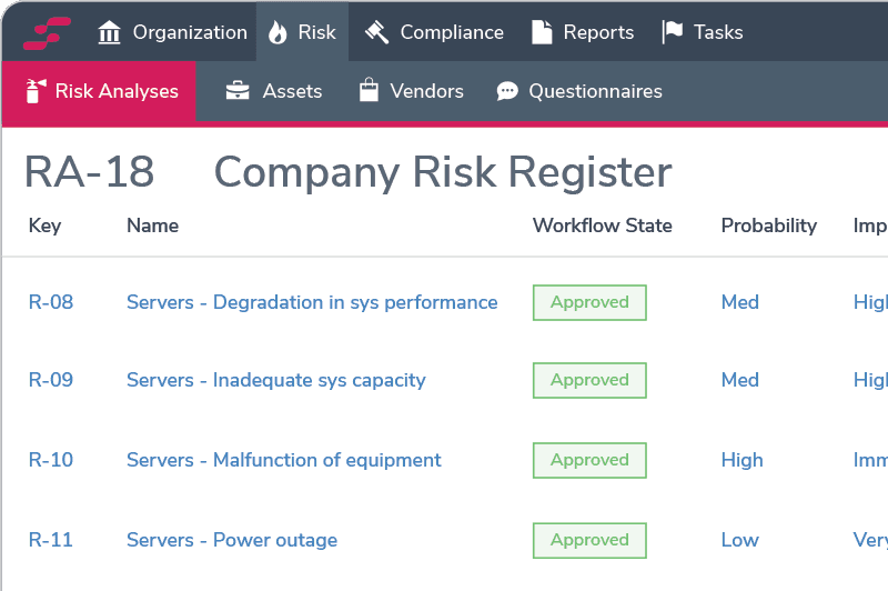
Common Tools for Risk Scoring
Spreadsheets
Tools like Excel and Google Sheets are easy to start with and offer flexibility, but they quickly fall short. There's no automation, poor structure, and version control can spiral out of control. They're fine for early-stage efforts, but not sustainable for a mature risk program.
General-Purpose Tools
Some teams use tools like Jira, Notion, or Asana to manage risk, especially if their organizational workflows already live there. This can boost visibility and team collaboration, but these platforms aren’t designed for risk and workarounds often create more friction than value.
Dedicated Risk Tools
These purpose-built platforms offer built-in scoring models, dashboards, and treatment workflows. They provide structure and make it easier to track risks over time. However, they can be limiting if they don’t integrate well with your broader compliance or audit ecosystem.
Integrated GRC Platforms
This is the gold standard, especially if you're serious about cross-functional risk management. These platforms connect scoring to your controls, audits, policies, and vendors. They centralize risk data, automate workflows, support custom scoring, and offer real-time dashboards and audit trails. Best for building a standardized, scalable, and repeatable risk program.
Visualizing Risk Data for Better Decisions
Risk visualization is the use of tools, like heat maps, to better illustrate risk data. It complements scoring by turning raw numbers into visual stories that stakeholders can easily understand and act upon. Instead of sifting through spreadsheets or dense reports, they can quickly identify critical risks and make faster, better-informed decisions.
Below are common types of visualization methods:
Trend Lines
Trend line analysis tracks how risk scores change over time, highlighting patterns, anomalies, and directional changes in risk posture. With interactive dashboards, users can segment data by risk category, business unit, or owner, making it easy to move from high-level trends to detailed mitigation insights.

Heat Maps
Heat maps cluster risks by severity using color coding, making it easy to identify which risks require immediate action rather than ongoing monitoring. Risks are plotted on a two-dimensional grid based on likelihood and impact scores, with colors ranging from green to red representing increasing severity levels. This visual layout enables quick identification of high-risk areas requiring urgent attention.

Risk Trajectory Charts
Risk trajectory charts track how individual risks move across the risk matrix over time, using directional lines or arrows to show movement along likelihood and impact axes. This visualization reveals which risks are escalating, stabilizing, or being successfully mitigated, enabling proactive planning by surfacing trends in risk behavior and supporting more strategic risk management decisions.
Bubble Charts
Bubble charts visualize risk clusters as circles, using size and placement to show concentrated areas and to help identify patterns. The size of each bubble can be adjusted based on what’s relevant to a company's needs, such as financial impact, number of affected systems, or remediation costs. Bubbles are positioned by likelihood and impact, with opacity variations helping differentiate dense risk clusters from less significant ones, enabling teams to focus attention where it's most needed.

Enhanced Bubble Chart Applications
Some organizations enhance their bubble charts with additional metrics to provide deeper insights. Control ratings and financial values can be incorporated using color codes to highlight how well risks are being managed, and size codes to illustrate each risk's financial value. Letters in the grid indicate risk categories such as operational, financial, or strategic risks.
Other teams use bubble charts to demonstrate risk velocity and proximity, revealing not just likelihood and impact but also urgency and the organization's capacity to respond effectively. For example, black coloring might indicate risks occurring within one year, while star shapes could represent risks with no reaction time once they materialize.


Risk Appetite Tolerance Zones
Another method of using bubble charts and heatmapping is to combine them with risk appetite. The visualization is used to demonstrate an organization's tolerance level for each risk and helps easily identify which risks exceed those acceptable boundaries. In this example, the colour of the bubble is an identifier for which risks are outside of risk appetite.

The Value of Risk Visualization
Simplifying complexity: Risk data can be overwhelming, especially when drawn from multiple sources. Visual tools make it easier to digest and interpret.
Improving understanding: Executives and board members often don’t have time to read through detailed risk reports. Visuals offer instant clarity.
Enabling prioritization: Visuals make it easy to see which risks fall within acceptable limits and which require immediate action.
Pattern recognition: Visualization reveals trends and correlations that may not be obvious in textual formats.
Conclusion
Risk scoring is more than just a compliance requirement; it’s a strategic tool that drives better business decisions. Using risk scoring tools to automate scoring and visualize data turns complex information into clear, actionable insights. This approach streamlines risk management, enabling faster, more confident decision-making.